Covid-19 Charts
Like many New Yorkers, Pentagram’s Giorgia Lupi and team organize their day around Governor Andrew Cuomo’s press conferences and have come to rely on his steady explanation of where we are in the fight against Covid-19. With uncertainty and misinformation rampant, these regular, measured daily briefings have become a lifeline to reliable guidance. As information designers, the team has also been pleased to see the starring role that graphs and tables have played in these crucial presentations, and often see slides circulating afterward on social media.
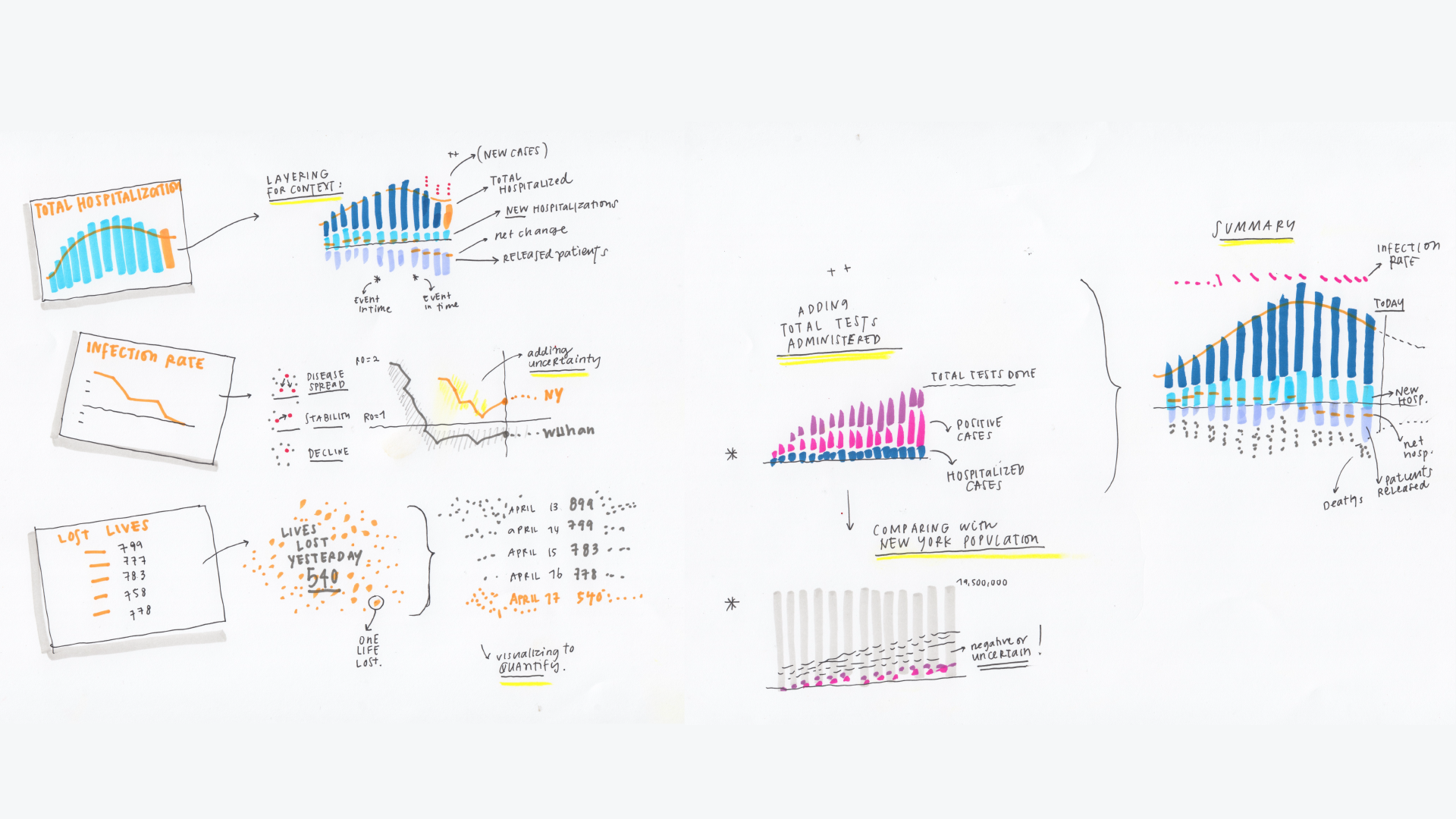
Even with their appreciation for the Governor’s approach, the designers saw the potential to improve the visualizations of his slide deck to more effectively and vividly communicate these important statistics. They wanted to inject more nuance, context and humanity into the Governor’s various graphs and charts, without sacrificing the exactitude the public has come to depend on. As a team, they decided to take a crack at redesigning the slides as a speculative exercise.
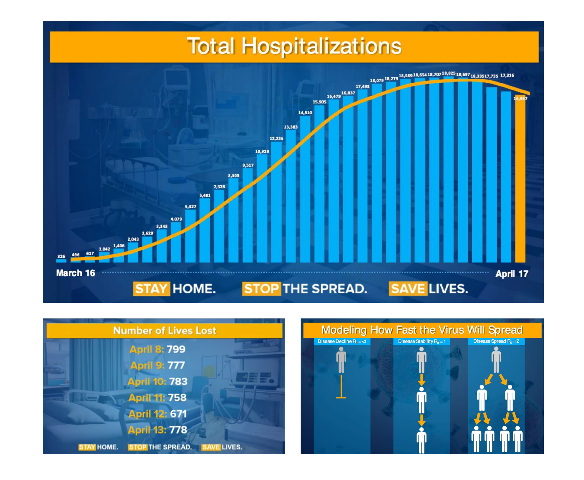
The designers began their work by conducting an audit of the Governor’s presentations to date, trying to understand what made his visualizations effective, while also identifying areas they knew they could target for improvement. After rewatching several of his presentations, they quickly saw that legibility and simplicity were key. The data are vital statistics that everyone needs to know, so this was no time for anything less than total clarity. But they also realized that important, even critical information was being glossed over and ignored in these visual aids. There were additional insights hiding in the data, ones they felt were important to surface for the New Yorkers who tune in every day.
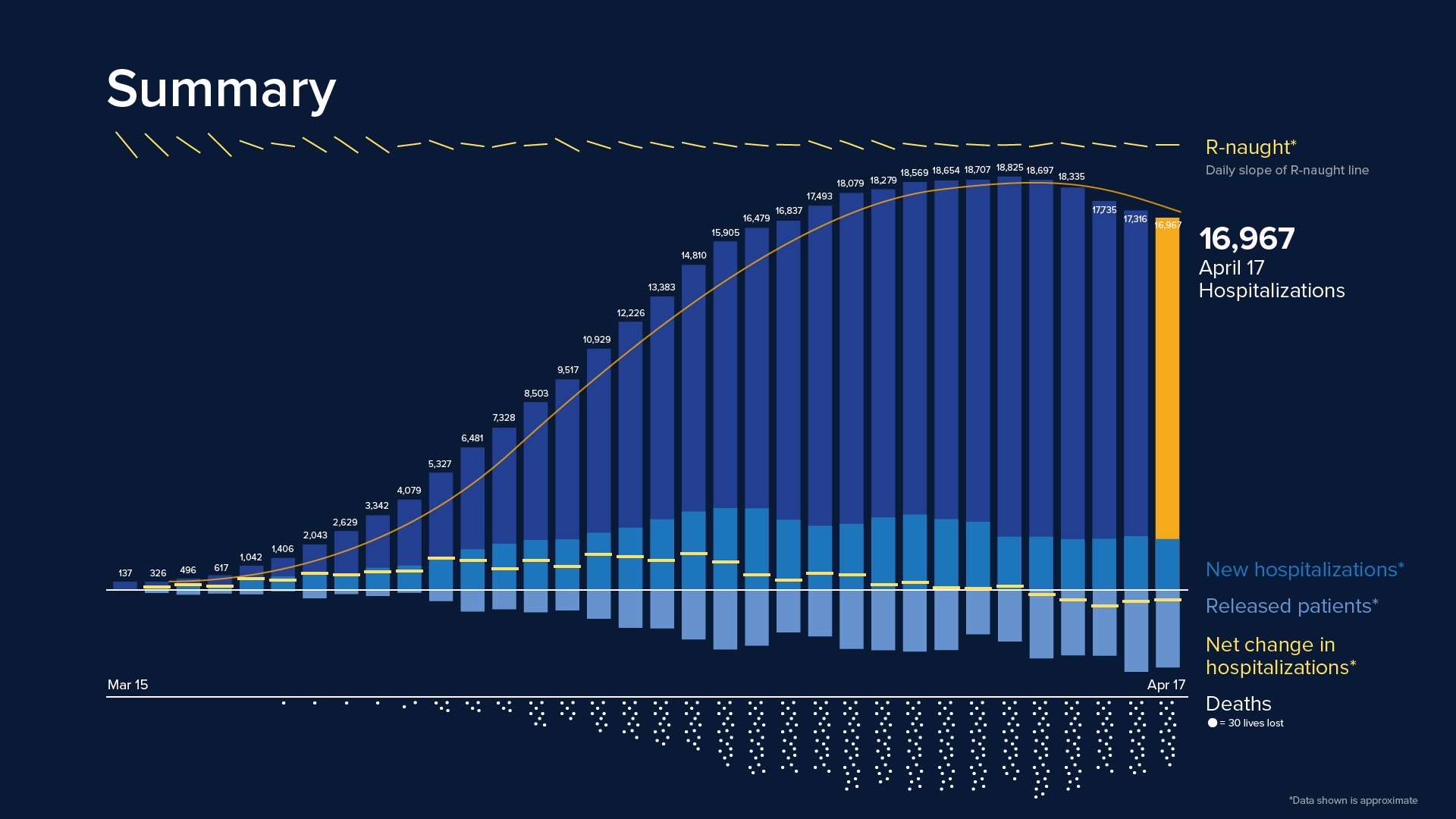
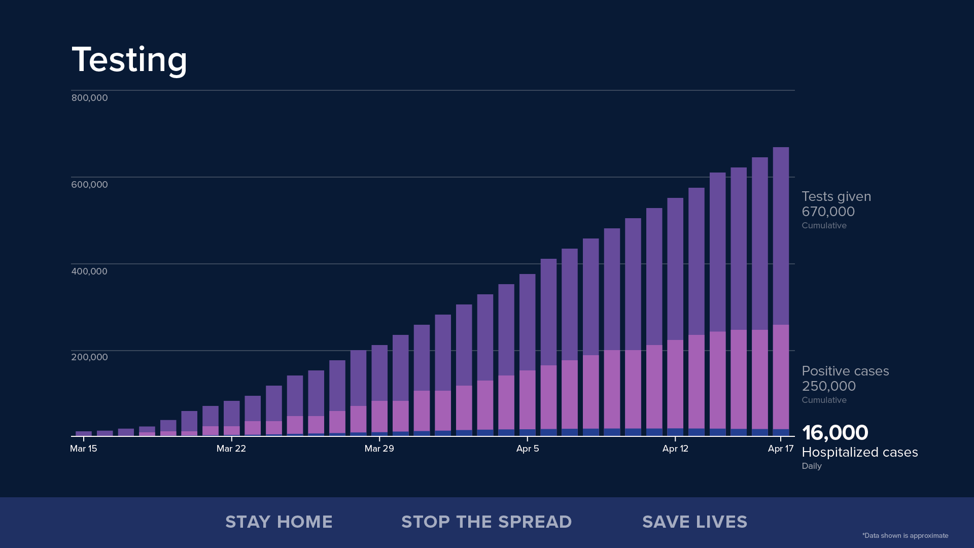
The team also noticed that a few graphs are reliably shown at every press conference: a bar graph of hospitalizations, a list of numbers signifying deaths per day, and then a diagram illustrating the R0, or “R-naught,” the average rate of infection for the virus. The team decided to focus on these three core visualizations, redesigning them from the ground up and adding new layers of data that would enrich them. The designers also created a new visualization for COVID-19 tests given versus positive diagnoses. As testing becomes more prevalent across the state, they wanted to imagine what this graph should look like.
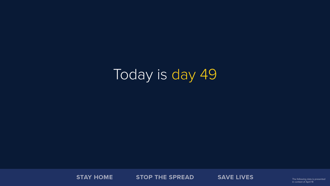
The new visualizations contain key elements of the originals, including the color palette and fonts specified in New York State’s brand guidelines, and the familiar “Stay Home, Stop the Spread, Save Lives” footer graphic seen in the Governor’s slide deck.
It’s important to reiterate that redesigning the slides is a wholly speculative exercise. Giorgia and her team are designers, not statisticians, and are not experts on these numbers. They know for instance that there are considerable discrepancies in how data is being collected by hospitals and health agencies. Some of the data included in these slides are not present in publicly available sources, so the designers had to make informed conjectures (noted with asterisks).
Despite these shortcomings, the designers believe this work is a meaningful starting point for more successful data visualizations. Their role here is merely as engaged citizens who care deeply about ensuring comprehensive understanding of the pandemic’s unfolding impact. Above all, they hope this project begins a conversation about the role of information design in crises such as these, and will continue to iterate on this work as more feedback is collected from the field.
Full project details︎
Covered by Fast Company︎
Designed in Illustrator. April 2020.
Even with their appreciation for the Governor’s approach, the designers saw the potential to improve the visualizations of his slide deck to more effectively and vividly communicate these important statistics. They wanted to inject more nuance, context and humanity into the Governor’s various graphs and charts, without sacrificing the exactitude the public has come to depend on. As a team, they decided to take a crack at redesigning the slides as a speculative exercise.
The designers began their work by conducting an audit of the Governor’s presentations to date, trying to understand what made his visualizations effective, while also identifying areas they knew they could target for improvement. After rewatching several of his presentations, they quickly saw that legibility and simplicity were key. The data are vital statistics that everyone needs to know, so this was no time for anything less than total clarity. But they also realized that important, even critical information was being glossed over and ignored in these visual aids. There were additional insights hiding in the data, ones they felt were important to surface for the New Yorkers who tune in every day.
The team also noticed that a few graphs are reliably shown at every press conference: a bar graph of hospitalizations, a list of numbers signifying deaths per day, and then a diagram illustrating the R0, or “R-naught,” the average rate of infection for the virus. The team decided to focus on these three core visualizations, redesigning them from the ground up and adding new layers of data that would enrich them. The designers also created a new visualization for COVID-19 tests given versus positive diagnoses. As testing becomes more prevalent across the state, they wanted to imagine what this graph should look like.
The new visualizations contain key elements of the originals, including the color palette and fonts specified in New York State’s brand guidelines, and the familiar “Stay Home, Stop the Spread, Save Lives” footer graphic seen in the Governor’s slide deck.
It’s important to reiterate that redesigning the slides is a wholly speculative exercise. Giorgia and her team are designers, not statisticians, and are not experts on these numbers. They know for instance that there are considerable discrepancies in how data is being collected by hospitals and health agencies. Some of the data included in these slides are not present in publicly available sources, so the designers had to make informed conjectures (noted with asterisks).
Despite these shortcomings, the designers believe this work is a meaningful starting point for more successful data visualizations. Their role here is merely as engaged citizens who care deeply about ensuring comprehensive understanding of the pandemic’s unfolding impact. Above all, they hope this project begins a conversation about the role of information design in crises such as these, and will continue to iterate on this work as more feedback is collected from the field.
Full project details︎
Covered by Fast Company︎
Designed in Illustrator. April 2020.