Bulletin of the Atomic Scientists
The Doomsday Clock is the graphic symbol of the world’s proximity to annihilation through dangerous technologies of our own making. Created in 1947 by the Bulletin of the Atomic Scientists, the advocacy group formed in 1945 by scientists from the Manhattan Project, the Clock is periodically updated, with its minute hand moved forward or backward from midnight, or metaphorical doomsday. In 2021, the Bulletin has decided to keep the Clock at its current setting of 100 seconds to midnight––where it was moved in 2018 and remains the closest it has been to midnight since 1953––in recognition of the continuing threat to humanity from nuclear war, climate change and disinformation.
Pentagram partner Giorgia Lupi and team have created a series of data visualizations to accompany the 2021 announcement of the Doomsday Clock’s position. This is the first time the report has incorporated additional visual information on the man-made threats to our planet, and the infographics provide a detailed introduction to the issues at hand. (The Clock itself was previously redesigned by Pentagram in 2007, and has been periodically updated by the designers as the time has advanced or reversed.)
The Doomsday Clock is a strong, simple icon that dramatically conveys how close the world is to destruction. The new visualizations go beyond the symbol to provide more granular information about what has brought the planet to the brink. The Bulletin has reset the minute hand on the Clock 24 times since its debut in 1947. Every time it is adjusted, the group is flooded with questions about the symbol and why the hands have been moved. For the latest announcement, the Bulletin wanted to offer an idea of the amount of research and discussion that actually goes into the decision to reposition the Clock.
The Clock is most closely associated with nuclear risk, but its purview has included climate change since 2007 and now also encompasses disruptive technologies. The designers developed visualizations for each of these topics, reinforcing the Bulletin’s wider focus. The infographics were not created to aid in the decision making of the group, but rather are meant to illustrate everything that goes into it. The Pentagram team was invited to listen in on the deliberations of the Bulletin scientists, advisors and policy leaders to gather information and hear the considerations that lead to updating the Clock.
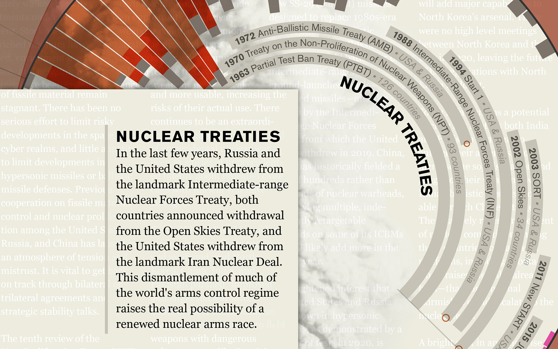
The dense visualizations have been layered with qualitative and quantitative data that provide depth of detail and build a comprehensive narrative of the issue and its impact on the world. The events of 2020 are highlighted, but set within the context of the past, to offer a larger look at the history that has led to the present moment.
For the designers, this meant going beyond simple bar charts and timelines to create something more dynamic and impactful. Each visualization utilizes a different form and has its own distinct color palette (red and orange for the infographic on nuclear risk; blue and green for the diagram on climate), but they all visually tie together as a group. The designs incorporate circular forms that echo the shape of the Clock and that reinforce the cyclical, time-based nature of the underlying issues, which are not always so linear. The Doomsday Clock appears on each, along with the message that “It is 100 seconds until midnight.”
To make the visualizations more memorable, the backgrounds feature a collage of imagery and the hint of text, which was drawn from the discussions of the advisory panel and suggests the amount of analysis that went into the decision.
Climate change is the focus of the second visualization, “A Warming Planet,” which is presented as a flowing linear timeline. The section representing 2020––one of the warmest years on record––has been enlarged as though under a magnifying glass, zooming in on the effects of environmental disasters such as wildfires and hurricanes, as well as the reduction of carbon dioxide emissions due to the economic slowdown caused by the Covid-19 pandemic. Looking forward, the timeline projects rising temperatures and sea levels through 2100 and beyond.
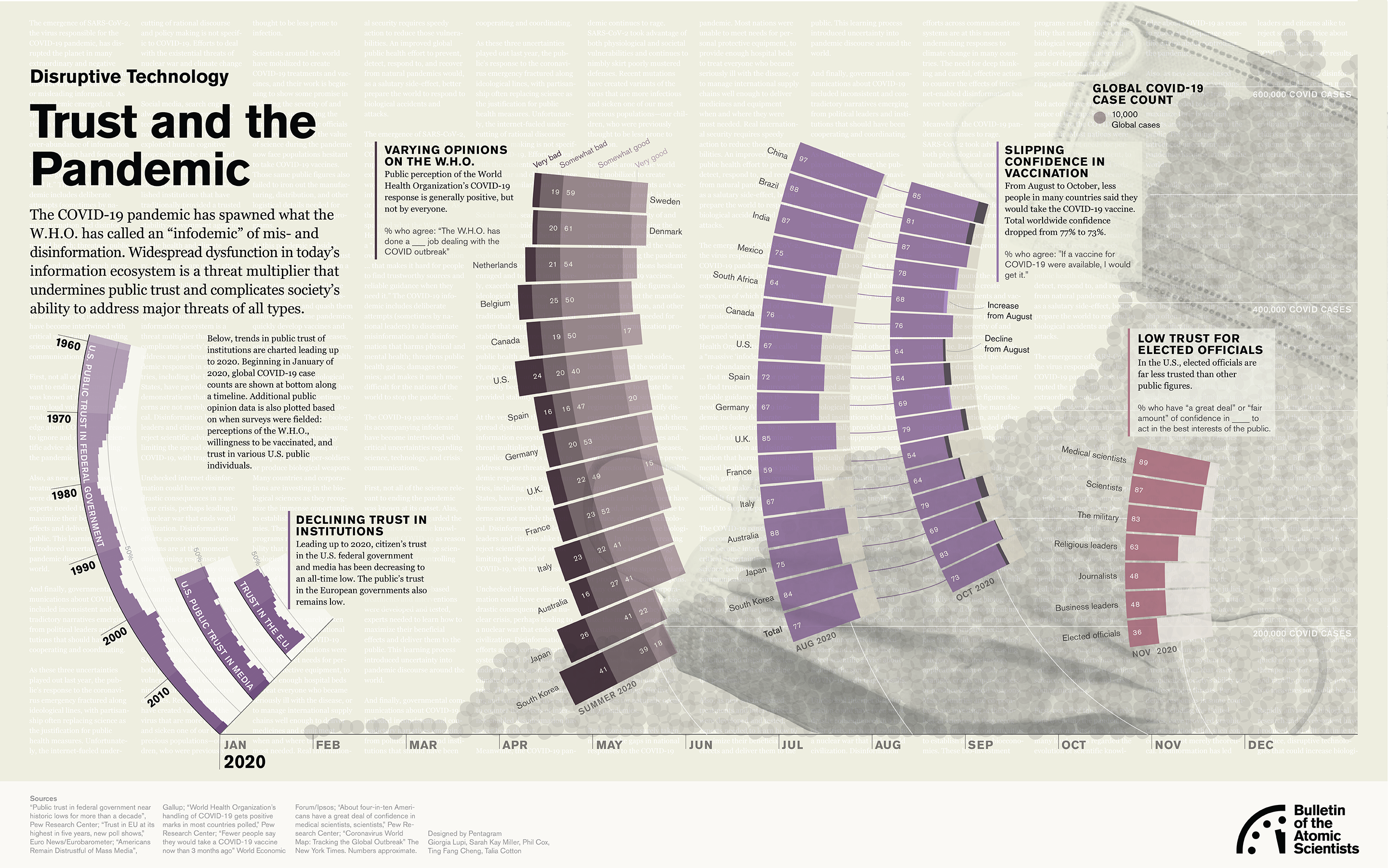
The disruptive technology visualization focuses on the Covid-19 pandemic, which has generated what the World Health Organization calls an “infodemic” of misinformation that undermines the public trust and society’s ability to address major threats of all kinds. Here, data sets on declining faith in institutions, varying opinions on the W.H.O., and slipping confidence in vaccination are depicted in a series of bar graphs that swell like waves of infection. In the background, a chart depicts the explosion of cases worldwide over the past year.
The complete set of data visualizations can be accessed via the Bulletin of Atomic Scientists website, where visitors can also download the full report.
Full project details︎
Designed in Illustrator. January 2021.


