The Gates Foundation
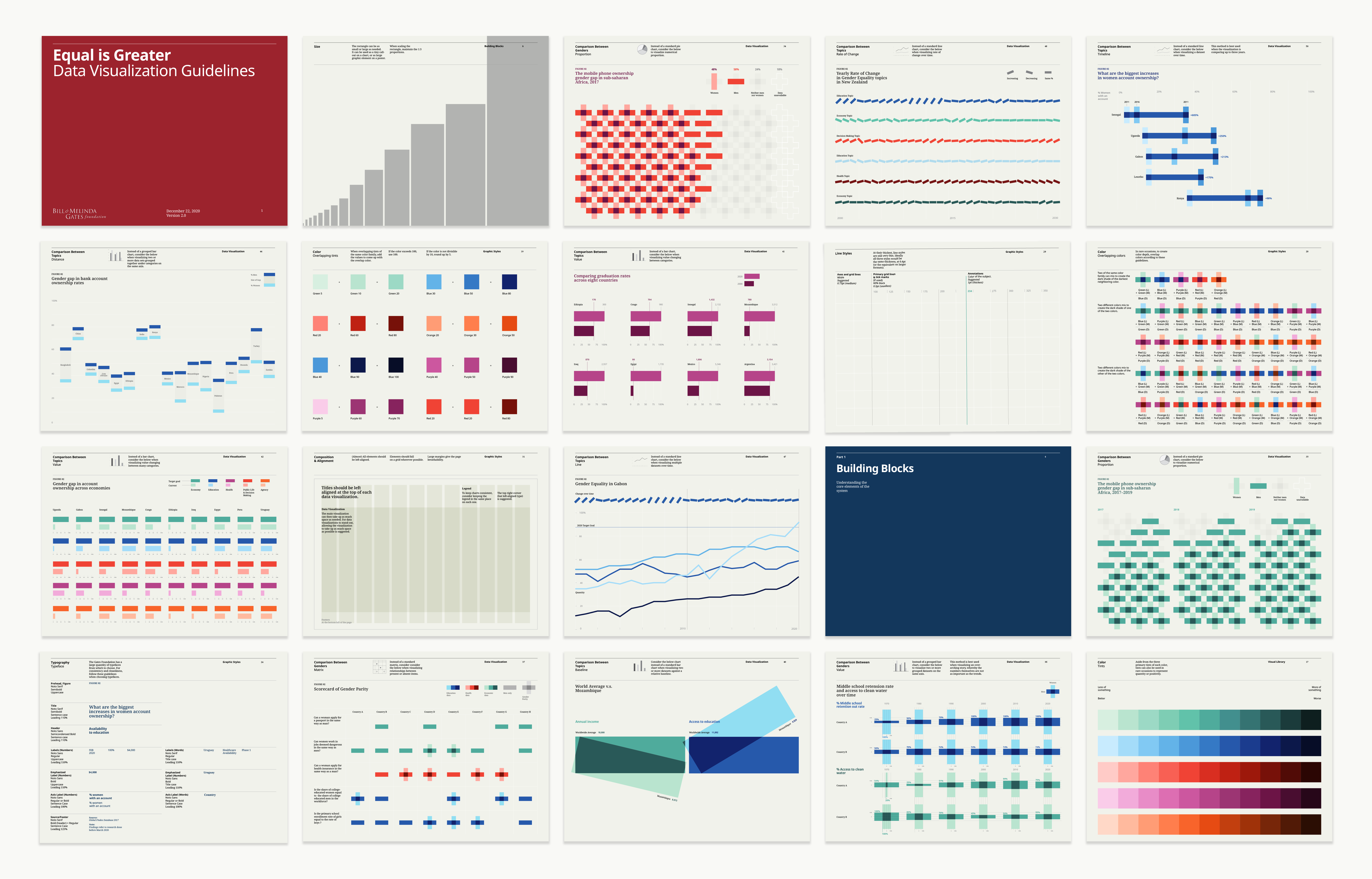
Our team at Pentagram developed a new data visualization brand system that combines the pragmatism of information design with the graphic expressiveness of a visual identity program. Created in collaboration with the Bill & Melinda Gates Foundation, the system was conceived to help tell rigorous, branded, and above all human stories about gender equality. The end result, dubbed a “creative platform,” is an innovative, data-driven visual language that represents a new model for how brands can communicate to their audiences with—and through—data.
As issues of gender equity, access, and justice become more and more acute thanks to Covid-19, the team saw a broad mandate for their work, with the understanding that gender is not a side issue, but indeed embedded in every aspect of human society.
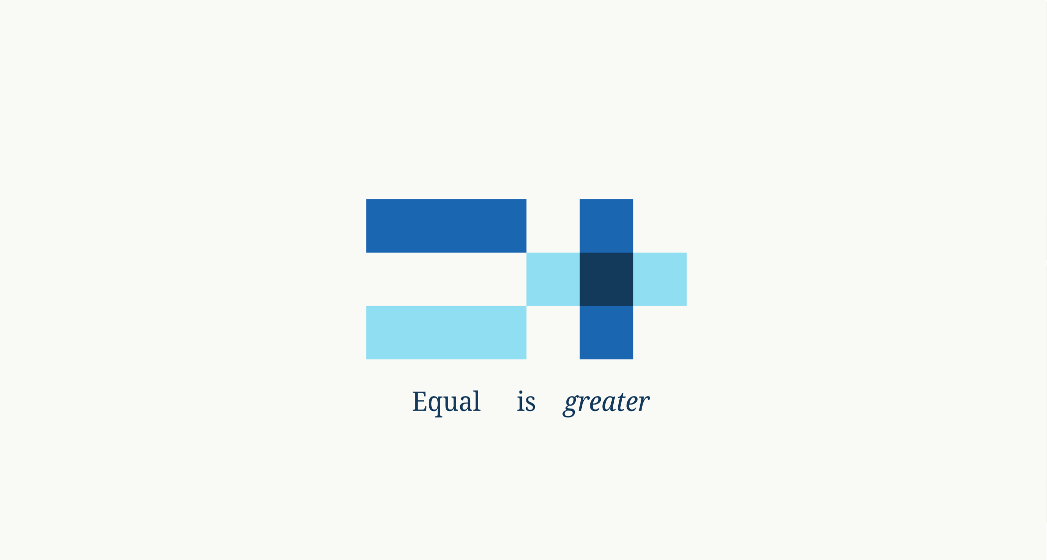
Every element is constructed out of an equal sign (=) or a plus sign (+), reinforcing the centrality of these two concepts to the pursuit of meaningful gender parity. The plus and equal signs also often overlap, visually alluding to the idea of integration and gender as a lens through which to see the world. This graphic framework functions similarly to a logo or signature mark, while its simplicity and flexibility ensures that the creative platform can successfully grow to accommodate any type of data, content, messaging, or secondary topic.
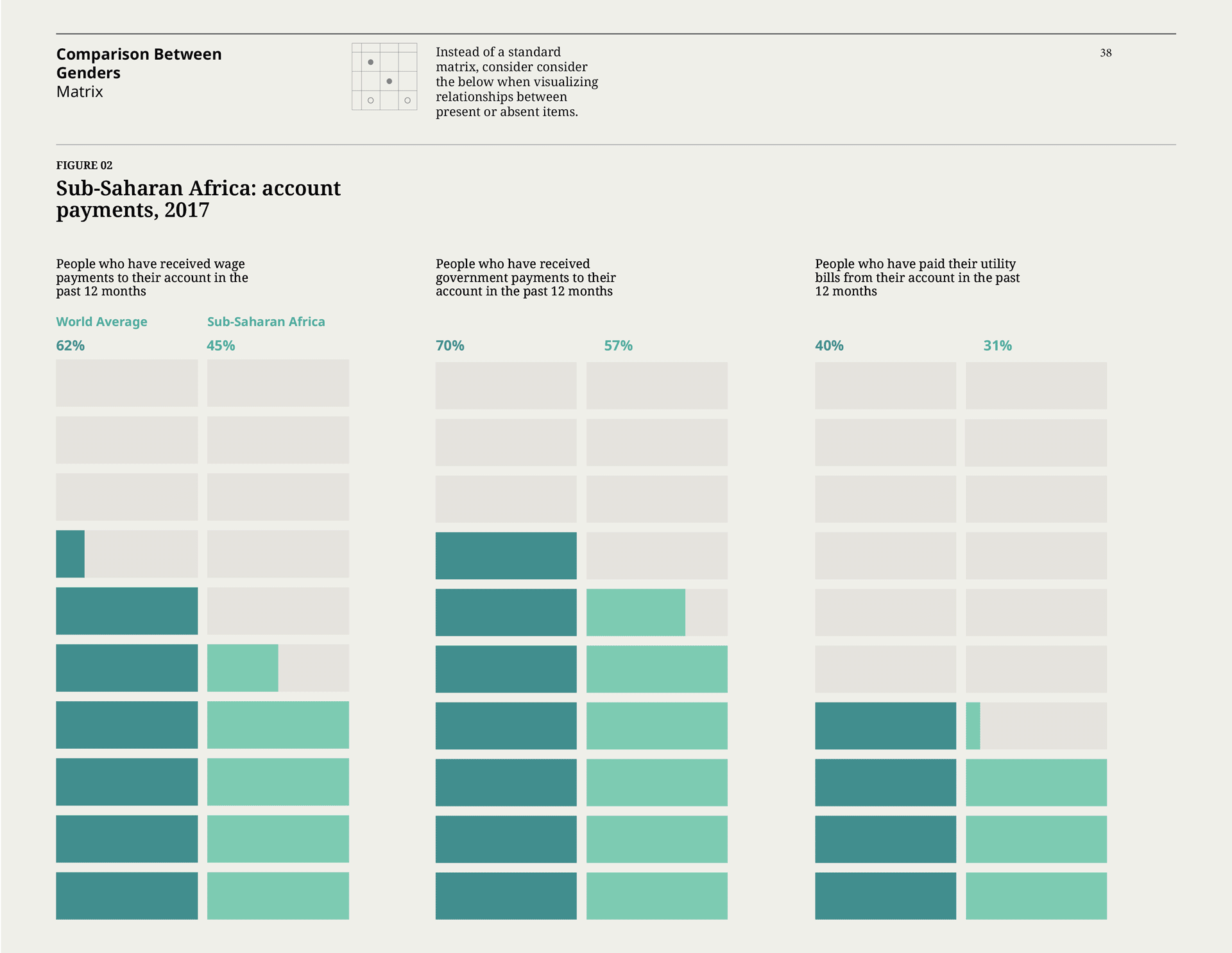
The core of the project was the creation of a vast, “kit of parts” design system that is innately data-driven and can be deployed in a variety of contexts and media. More than ten unique data visualization templates were created, always using the principle + and = motif, to demonstrate the different ways to communicate gender data. Each of the ten visualizations are unique, and move beyond traditional dataviz forms like bar charts or pie graphs to establish a thoroughly ownable graphic lexicon.
The idea of “missing data” was also key to the team’s work. Quite literally, data is sexist: many countries do not collect data specifically about the lives and welfare of women, or the data is collected in such a way to be methodologically biased. To represent this sad reality (and emphasize the need for change) the creative platform explicitly calls out missing data as a type of data point itself, giving special credence to gaps in knowledge that may be clouding our understanding of this important issue.
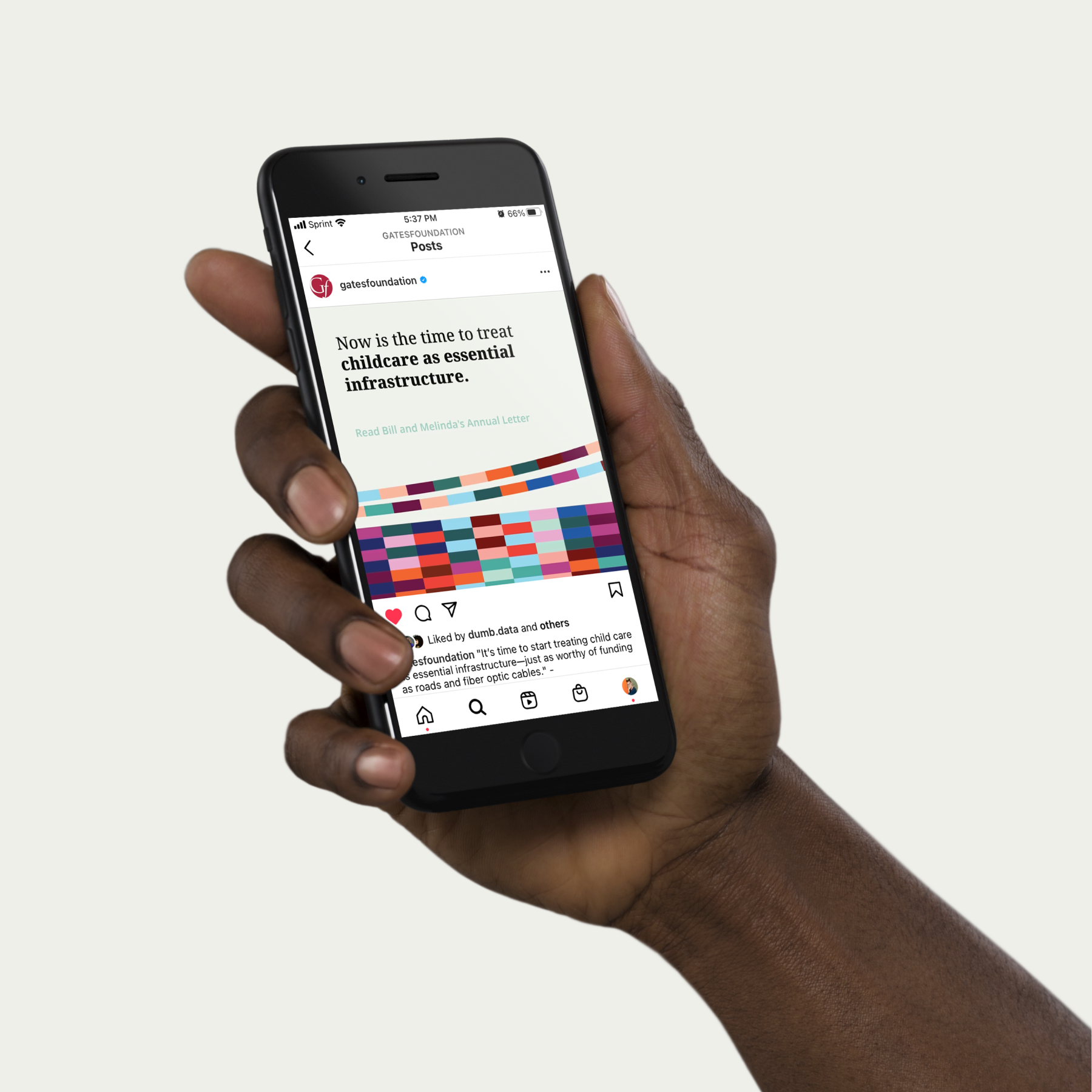
Since its introduction, the creative platform has been applied across various consumer touchpoints, from digital storytelling experiences to explain the pandemic’s impact on the economic livelihoods of women, to communications campaigns that focus global action on implementing gender-sensitive policy. As the world builds back from the pandemic in the years ahead, the creative platform can continue to help crystallize the urgent opportunity for a more equal society, and mobilize greater action and support using data-driven evidence.
Full project details︎
In collaboration with Giorgia Lupi, Ting Fang Cheng, Talia Cotton, Phil Cox.
Designed in Illustrator, Figma, InDesign, and AfterEffects. 2020–2022.
As issues of gender equity, access, and justice become more and more acute thanks to Covid-19, the team saw a broad mandate for their work, with the understanding that gender is not a side issue, but indeed embedded in every aspect of human society.
Every element is constructed out of an equal sign (=) or a plus sign (+), reinforcing the centrality of these two concepts to the pursuit of meaningful gender parity. The plus and equal signs also often overlap, visually alluding to the idea of integration and gender as a lens through which to see the world. This graphic framework functions similarly to a logo or signature mark, while its simplicity and flexibility ensures that the creative platform can successfully grow to accommodate any type of data, content, messaging, or secondary topic.
The core of the project was the creation of a vast, “kit of parts” design system that is innately data-driven and can be deployed in a variety of contexts and media. More than ten unique data visualization templates were created, always using the principle + and = motif, to demonstrate the different ways to communicate gender data. Each of the ten visualizations are unique, and move beyond traditional dataviz forms like bar charts or pie graphs to establish a thoroughly ownable graphic lexicon.
The idea of “missing data” was also key to the team’s work. Quite literally, data is sexist: many countries do not collect data specifically about the lives and welfare of women, or the data is collected in such a way to be methodologically biased. To represent this sad reality (and emphasize the need for change) the creative platform explicitly calls out missing data as a type of data point itself, giving special credence to gaps in knowledge that may be clouding our understanding of this important issue.
Since its introduction, the creative platform has been applied across various consumer touchpoints, from digital storytelling experiences to explain the pandemic’s impact on the economic livelihoods of women, to communications campaigns that focus global action on implementing gender-sensitive policy. As the world builds back from the pandemic in the years ahead, the creative platform can continue to help crystallize the urgent opportunity for a more equal society, and mobilize greater action and support using data-driven evidence.
Full project details︎
In collaboration with Giorgia Lupi, Ting Fang Cheng, Talia Cotton, Phil Cox.
Designed in Illustrator, Figma, InDesign, and AfterEffects. 2020–2022.